
Recent event poster for the Angry Orchard Community Harvest Fest

The brief asked for updated packaging that was more in line with the Angry Orchard national branding, while still maintaining some individuality to represent the Cider House in Walden. The art needed to be bold, vibrant, celebratory, inviting, fun, and communicate how flavorful our cider is. In addition, it was important that the art direction could be carried across collateral, advertising and merch to strengthen brand consistency overall.


The previous branding lacked excitement and color and didn't convey how bold and sweet the Angry Orchard brand is.


The old bottle labels


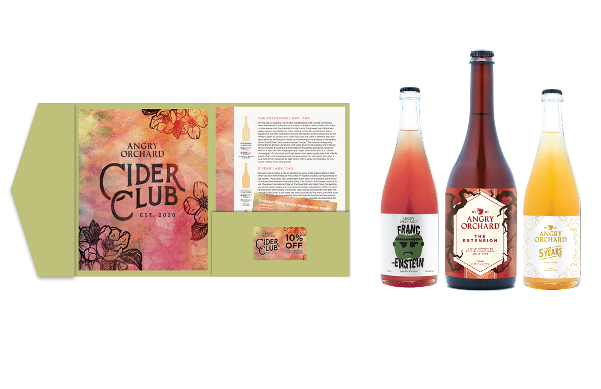
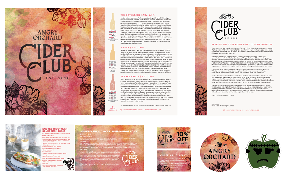
Branding for the new Angry Orchard Cider Club - a quarterly cider subscription box bringing the Cider House right to your doorstep. By hand lettering the logo I was able to achieve a simple but artistic and slightly vintage aesthetic. Each quarter the artwork changes to tie in to the season as well as the bottles you receive. A custom folder and wax seal were designed to make each shipment feel special. The folder includes the beautiful Cider Club cover art, a letter from Ryan Burk, tasting notes on each cider, a recipe card for a meal to pair with, a discount card, and stickers.
Advertising


